At the beginning of this video, there is one ninja sitting in a tree with a very colorful background. But then, suddenly, he springs. Using his blue fans, he flings what looks to be like spikes. However, as they are released, they turn into long, twisty strings of color. There are random things flying everywhere, such as fish. The ninja seems to be chasing a human, robot combination looking thing, that seems to be in some sort of space suit. As they run chasing each other, they look to be in a sort of video game. Locations flip back and forth and change in an instant. Then, suddenly, BANG! Everything goes black.
DJ Uppercut : The Attack of Ninja from Shane Lester on Vimeo.
Thursday, November 18, 2010
HELP DARFUR!!!!!
The people of Darfur are in desperate need of your help. A genocide has falling upon the people of Darfur. Thousands are killed each day. Even though we can't send our troops to help, we can send money over to the victims, that are in need of our generosity. To learn more about whats happening in Darfur, go to
www.hillel.org › Social Justice › Hillel Initiatives
Also, if you wish to donate, go to
https://secure3.convio.net/sdc/site/Donation2?df_id=1560&1560.donation=form1&gclid=CMfJ2LjgqqUCFRBNgwoduBalXg&JServSessionIdr004=ugcu69mgp6.app333b
www.hillel.org › Social Justice › Hillel Initiatives
Also, if you wish to donate, go to
https://secure3.convio.net/sdc/site/Donation2?df_id=1560&1560.donation=form1&gclid=CMfJ2LjgqqUCFRBNgwoduBalXg&JServSessionIdr004=ugcu69mgp6.app333b
Tuesday, November 16, 2010
Fed-Ex and UPS: Who Will Win?
Usually when think of a package being brought to you house, you wouldn't take much thought into how it got there. However for those who do, they realize that UPS and Fed-Ex are in a never ending battle to be on top. In this video, UPS and Fed-Ex are represented by people in brown suits and people in purple, white, and orange suits. To them, delivering the package is not only a race, but a chance to see, who is the fastest, and who will get the package first as well. To me, the whole process seemed kind of like a huge game of football, combined with a small dose of that childhood game that we all used to play, monkey in the middle. As they fly through space, they both seem to have an equal opportunity at winning the battle. However as the race nears an end, the viewer can now see that UPS is destined to be the conquerer. Although that, as we find out, is not true. As the two try to regain the control of the package at the front doorsteps of the packages owner, something peculiar happens. The package has grown four legs, white legs. You can also see that inside the package, this thing has glowing eyes. UPS notices right away, however as Fed-Ex is still fighting him, he has to turn Fed-Ex's head upsidown so that he can see what has happened to the package they tried so hard to deliver. As they both start to reach for the package, it runs inside through the doggy-door. To me, niether of them winning seemed like a message meant to say something to both of those shipping companies. And the message is this; no matter how much you think that your company is better than the other one in some way, it's not. You are both the same, in every way.
Galactic Mail from Asterokid on Vimeo.
Tuesday, October 5, 2010
"Let Go" music video
Crazy.The one word that comes to mind when watching this amazing masterpiece. The song that they played in this video was interesting. It was very, different. They only had 1 line that they repeated over and over again, and I thought that there was little creativity when it came to the song. Although, I did think that the music went very well with the drawings. The drawing were amazing! They were so unique, and I can only imagine the work that went into creating them. The way that the artist used color in an unordinary way was really creative. I'm not quite sure if this was trying to convey a message, but to me it seemed to be saying, "why does the world have to be perfect?" and "why can't the world accept unordinary creatures?". Overall, I enjoyed this video, more than I thought I would.
The Japanese Popstars Feat. Green Velvet - Let Go from David Wilson Creative on Vimeo.
Wednesday, September 29, 2010
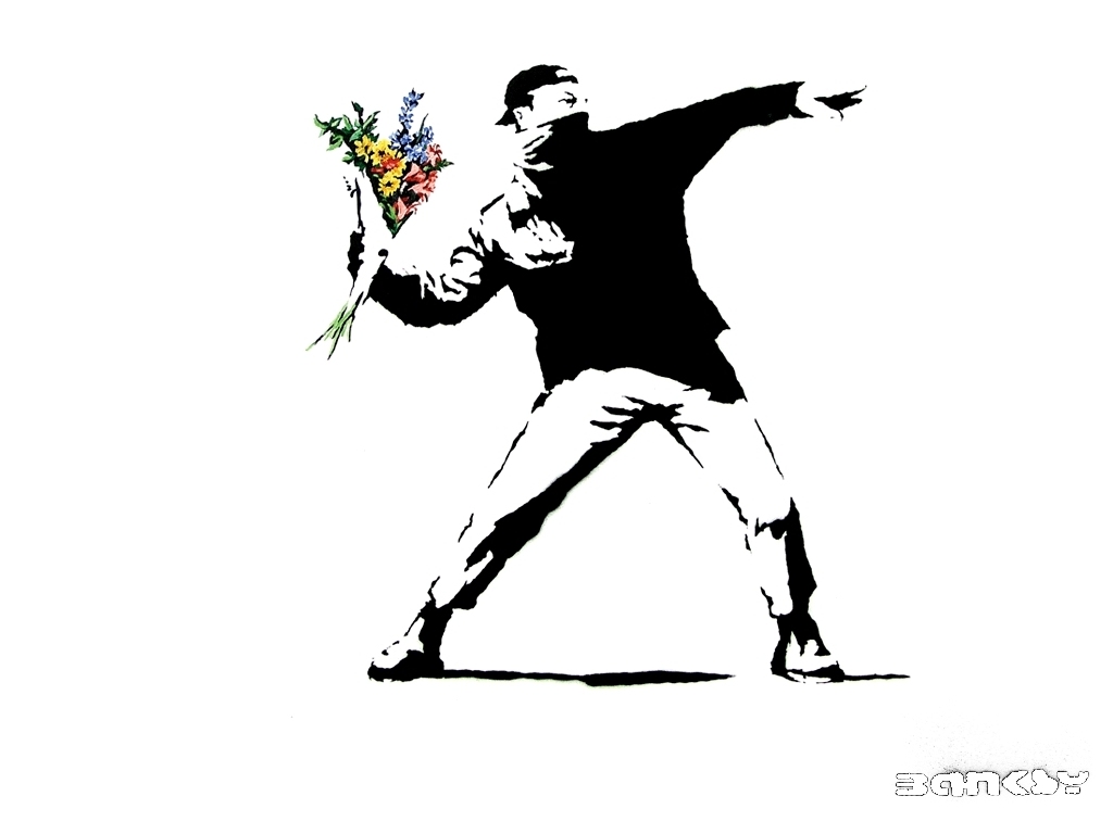
Banksy
This is a picture that can mean different things to different people. The man in this picture is simple, only depicted in black and white. To me he seems just like an ordinary citizen. I think this because of the baseball cap. If he had planned the attack, i would have assumed that he would have covered his whole face. He has covered part of his facnd his with what looks like a bandana, and his eyes are squinted. He is holding flowers and it looks like he is trying to through them. The flowers are brightly colored, unlike him, and they are depicted in great detail. I think that this man wanted got angry at something someone, who in my opinion was most likely making a speech, and wanted to through something that sent a message. To me, it's as if he's saying, "You want peace? Well you can forget about that!".

Monday, September 27, 2010
Sry I'm Late...
This stop motion animation is very clever and inspiring. A fantasy way of telling a story about someone being late. This was very creative. I have a lot of respect for anyone who does something like this, especially with such detail. This is a very time consuming project to take on. At the end, I liked the way they showed how they created the horse back scene. To move things, come back, take a picture, move things, come back take a picture ect. doing the same thing over and over again must be tiring. The way that the whole story moved along was really unique. I thought it was cool how he would go to the guy riding on a horse, to driving a car, and then he and the car landing in a tree where someone was swinging. This video was so unique, I loved it.
Sorry I'm Late from Tomas Mankovsky on Vimeo.
Sorry I'm Late from Tomas Mankovsky on Vimeo.
Tuesday, September 7, 2010
Personality Art

Simple and innocent. That's what this picture is. I chose this picture because it looks very life like. It only uses three colors, but yet that's enough for it to look amazing. This is a beautiful picture. I think that this picture is beautiful because of the simplicity. By using as few colors as possible, it makes it look more real. If more colors were added, I think that it would look more abstract. It is amazing how something so simple, could take a lot of imagination, thinking, and skill.
Subscribe to:
Comments (Atom)